
APEX
Designing Cloud-as-a-Service Product Experiences for a New Subscription Business Model
Dell APEX is Dell Technologies’ as a Service portfolio, delivering cloud, storage, compute, and data protection to enterprise infrastructure through a subscription model. It marked a shift from one time hardware sales to recurring services and introduced a new way for enterprise customers to consume infrastructure.
Problem
As APEX expanded, the digital experience did not evolve at the same pace. Dozens of offer pages grew organically, creating inconsistent structure, redundant content, and confusion around what APEX was and how its solutions differed. Enterprise buyers struggled to understand where to start and what action to take next.
Outcome
I led UX design for 10+ APEX product and offer pages that supported more than 60% growth in subscriptions and annual recurring revenue during a key expansion phase. Simplified the portfolio by standardizing page architecture, consolidating overlapping offerings, and aligning design decisions with iterative qualitative research.
Company
Dell Technologies
Role
Collaborators
Platform(s)
Responsive Web
Year
2022

My role
I led UX design for APEX product pages from 2022 to 2023, guiding a small team of designers and partnering with our UX researcher and product managers across multiple business units. I owned and oversaw the end to end design process from research through delivery, aligned stakeholders on structural decisions, and drove portfolio consolidation to improve clarity and scalability across the APEX ecosystem.
Understanding the system
Before designing individual pages, I needed to understand the broader system APEX lived within. APEX was not a single product. It was a growing portfolio spanning cloud services, custom solutions, industry use cases, and supporting resources. Each offering was owned by a different business unit, with its own goals, messaging priorities, and launch timelines.
As the portfolio expanded, structural tension emerged. Business units emphasized their individual solutions. Marketing focused on positioning. Enterprise buyers needed clarity and differentiation. The result was a rapidly expanding set of offer pages without a shared framework.
To move forward, I mapped the ecosystem across three dimensions:
Portfolio structure and category overlap
Buyer journey alignment
Stakeholder ownership across business units
This surfaced key systemic issues:
Redundant offerings framed as separate solutions
Inconsistent page architecture across categories
Misalignment between marketing messaging and technical buyer expectations
No clear hierarchy to support comparison and evaluation
Goals and success signals
After mapping the ecosystem challenges, I aligned stakeholders around clear goals for both enterprise buyers and internal teams, with defined signals to measure progress.
These goals defined what success looked like for the redesign and guided design decisions throughout the project.
Constraints and complexity
APEX was already in motion. The portfolio was expanding rapidly within an existing enterprise environment, shaped by technical, organizational, and operational constraints.
Key constraints
Distributed ownership across business units
Each APEX offer was owned by a different business unit with its own roadmap and revenue goals. There was no centralized portfolio governance model. Establishing shared structure required alignment across independently operating teams.
Marketing versus technical buyer tension
Marketing focused on positioning and differentiation. Enterprise IT buyers focused on architecture transparency and risk evaluation. The experience needed to support both without overwhelming either audience.
Legacy content and page sprawl
Offer pages had grown organically as the portfolio expanded. Messaging overlapped, hierarchy varied, and similar solutions were framed as separate offers. Fragmentation had become a portfolio level issue, not a page level problem.
Enterprise CMS and template constraints
The redesign needed to work within existing CMS capabilities and engineering bandwidth. Structural improvements had to be modular and technically feasible inside the established ecosystem.
Ongoing portfolio expansion
New APEX services were launching during the redesign. The system needed to support future growth without reintroducing inconsistency. Designing for extensibility was critical from the outset.
Early insight
What appeared to be a collection of inconsistent pages was actually a deeper portfolio architecture problem. As APEX expanded across business units, new offers were layered on without a shared structure for differentiation, hierarchy, or comparison. The result was fragmentation at scale. Solving this required more than refining individual pages. It required redefining how the portfolio was organized and evaluated as a system.
Platform structure and portfolio architecture
As the early insight made clear, the issue was not isolated to individual pages. It was structural. Before redesigning offers, we needed to define how the APEX portfolio should function as a coherent system.
Working closely with our UX researcher, product leads, and my design manager, I helped map the portfolio across categories, buyer journeys, and business unit ownership. This allowed us to step back from page-level execution and evaluate APEX at the ecosystem level.
Several patterns emerged:
Similar services were positioned as separate offers without clear differentiation
Category boundaries were blurred across cloud services, custom solutions, and use cases
There was no consistent hierarchy to support comparison
Navigation did not reflect how enterprise IT teams evaluate infrastructure
Rather than refining pages independently, we reframed the work as a portfolio architecture challenge. The goal became defining a clear, scalable structure that could support:
Distinct category definitions
Clear differentiation between adjacent solutions
Alignment with buyer evaluation stages
Future portfolio expansion without fragmentation
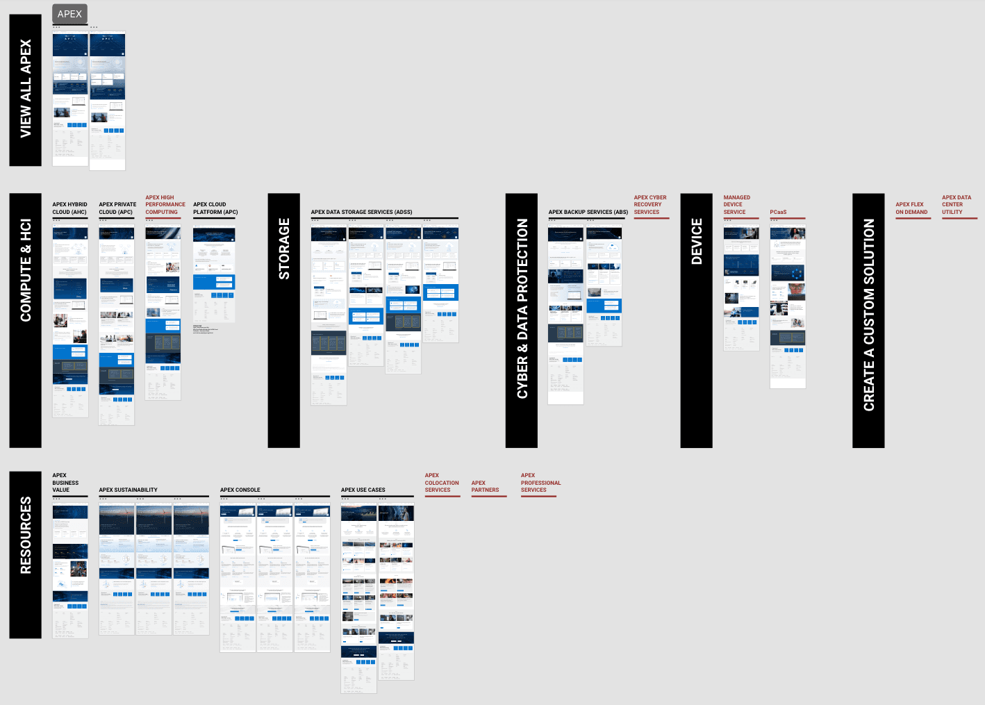
This shift allowed the team to move from reactive page production to intentional system design. To understand the scope of the ecosystem, I mapped the full APEX portfolio and grouped existing pages into categories. This helped visualize the scale of the platform and revealed where structure and differentiation were missing.
How might we design a scalable page framework that helps enterprise buyers evaluate APEX solutions while enabling multiple business units to launch offers consistently?
Standardizing page architecture
Once the portfolio structure was defined, the next challenge was creating consistency across individual offer pages. Pages had been built independently by different business units, resulting in inconsistent structure, messaging, and depth of technical detail.
Enterprise buyers evaluating infrastructure solutions needed predictable information architecture. They needed to quickly answer key questions such as:
• What is this offer?
• What business outcome does it support?
• How does it work?
• How does it compare to alternatives?
• What are the next steps?
To support this evaluation process, I defined a standardized offer page framework that organized content around these core questions while enabling teams across the organization to build pages using a shared structure.
Offer Page Framework
I introduced a standardized page framework organized around the key questions enterprise buyers ask when evaluating infrastructure solutions.
The structure provides a repeatable set of sections that support both business decision makers and technical evaluators while giving internal teams a shared foundation for launching new APEX offers.
Overview
Clear value proposition and core benefits, supported by validation signals such as customer proof points and analyst references.
How it works
Architecture explanations, operational model, and integration details for technical audiences.
Use cases
Examples of how organizations apply the service in real infrastructure environments.
Next steps
Clear progression toward trial, demos, or engagement with Dell teams.
Resources
Supporting documentation, white papers, and deeper technical material.
Designing the APEX product experience
With the portfolio structure and page framework defined, the next step was translating that strategy into the actual APEX product experience.
This work spanned multiple layers of the ecosystem, starting with the APEX homepage, continuing through the portfolio architecture, and extending into individual offer pages.
The goal was to create a clear evaluation path that helped enterprise buyers understand the portfolio, navigate between related solutions, and evaluate individual offers with confidence.
Redesigning the APEX entry point
The APEX homepage was the primary entry point into the platform, but the original experience functioned mostly as a marketing introduction rather than a navigation gateway. While it communicated the APEX value proposition, the portfolio itself was difficult to discover and required additional navigation to explore.
The redesign reframed the homepage as a starting point for navigating the APEX ecosystem, introducing clearer pathways into the portfolio and helping users quickly identify where to begin evaluating solutions.

Before - What wasn't working
The original homepage focused heavily on brand messaging and marketing modules. The portfolio was not immediately visible, requiring users to navigate deeper before they could explore available services.
As a result, many users struggled to understand where to begin or how APEX offerings related to one another.

After - A clearer starting point
The redesigned homepage surfaced core APEX service categories directly on the page, allowing users to move quickly from high level messaging into structured exploration of the portfolio.
The updated layout emphasized:
Clear pathways into the APEX portfolio
Distinct categories of services and solutions
Reduced content clutter that previously obscured navigation
This transformed the homepage from a marketing introduction into a functional gateway to the APEX ecosystem.
Key design decisions
Introduced a portfolio-first homepage layout that surfaced core APEX solution categories directly on the page
Created clear entry points into the portfolio to help users move from high level messaging into solution exploration
Reduced competing marketing modules to prioritize navigation and product discovery
Established a scalable entry pattern that could support future portfolio expansion
Why this mattered?
Reframing the homepage as a gateway to the portfolio helped users quickly understand where to begin and how APEX was organized. By surfacing solution categories directly on the homepage and reducing navigation friction, the experience better aligned with how enterprise buyers explore infrastructure solutions. It also established a scalable entry pattern that supported the broader portfolio architecture and made it easier to introduce new services without increasing complexity.
Organizing the APEX portfolio
With the homepage acting as a clearer entry point, the next step was organizing how users explored the APEX ecosystem itself. At the same time, the portfolio was still evolving internally. Different business units were actively refining how their services should be positioned, merging some offers while introducing new ones. As a result, the portfolio needed to support constant change without becoming confusing for users. To address this, the portfolio was organized into a flexible category structure that grouped related services while allowing the ecosystem to expand or consolidate over time.

Portfolio structure
From the homepage, users could enter the APEX portfolio through clearly defined solution categories. Each category represented a group of related services designed to address specific infrastructure needs.
This created a clearer hierarchy that helped users understand how solutions were organized within the platform rather than encountering disconnected offer pages.

Expanding into individual offers
Within each category, users could explore individual APEX services. The structure allowed buyers to move from high level solution areas into specific offers while maintaining context within the broader portfolio.
Because services could be added, removed, or consolidated as the portfolio evolved, the structure was designed to support both expansion and simplification without disrupting navigation.
Key design decisions
Organized APEX services into clearly defined solution categories
Designed a hierarchical navigation model from homepage → portfolio → offer pages
Grouped related services to support easier comparison and discovery
Created a flexible structure that could accommodate new offers, consolidations, and portfolio changes over time
Maintained contextual navigation so users could move between related solutions without losing their place
Why this mattered?
Introducing a clear portfolio structure helped users understand how APEX services related to one another and where to begin exploring solutions. Instead of encountering isolated pages, buyers could navigate the ecosystem through logical categories and progressively move from platform overview to detailed offer evaluation. Just as importantly, the structure supported the reality of a rapidly evolving portfolio. As services were added, merged, or repositioned by different business units, the navigation model remained stable and understandable for users.
Designing scalable offer pages
With the portfolio structure established, the next step was designing the individual offer pages where buyers evaluated specific APEX services. These pages needed to support multiple audiences. Business decision makers needed to quickly understand the value and outcomes of a solution, while technical evaluators required deeper architectural and operational detail. To support both audiences, I introduced a standardized offer page framework that organized information in a consistent and predictable way across the portfolio.

Offer page structure
Each offer page followed a shared structure designed around the key questions enterprise buyers ask when evaluating infrastructure solutions.
The framework balanced high level value messaging with deeper technical information, allowing users to move from understanding the solution to evaluating implementation details.
Key sections included:
Overview — value proposition and core benefits
How it works — architecture and operational model
Use cases — real world application scenarios
Next steps — demos, trials, or engagement paths
Resources — documentation and technical materials
The standardized framework was applied across dozens of APEX service pages, enabling different business units to launch new offers while maintaining a consistent structure.
Key design decisions
Introduced a standardized page architecture across all APEX offer pages
Structured information progressively from business value to technical detail
Designed pages to support multiple audiences including decision makers and practitioners
Created a consistent layout that made it easier to compare solutions across the portfolio
Ensured the framework could support future offers without redesigning page structures
Why this mattered?
Standardizing the offer page structure made it easier for buyers to evaluate APEX services and navigate the portfolio with confidence. Because every offer page followed the same framework, users could quickly orient themselves and focus on the information most relevant to their evaluation process. For internal teams, the framework also simplified the process of launching new services by providing a reusable structure that supported a rapidly evolving portfolio.
Final solution overview
After defining the portfolio structure and standardizing the offer page framework, I designed an end to end experience that helped enterprise buyers understand, explore, and evaluate APEX services.
The final experience connected the homepage, portfolio navigation, and offer pages into a cohesive journey that guided enterprise buyers from discovery to solution evaluation. The prototype demonstrated how buyers could move through the ecosystem of APEX services while maintaining clarity about how different offerings related to one another.
Solution walkthrough
The walkthrough below highlights how these patterns come together across the platform.
Impact
The project introduced a scalable framework for organizing and evaluating Dell APEX services online.
Key outcomes:
Contributed to a 60% increase in APEX subscriptions alongside broader product and marketing initiatives
Established a scalable portfolio structure for organizing APEX services
Introduced a consistent framework for evaluating infrastructure offers
Reduced fragmentation across individual product pages
Created reusable patterns that supported future service launches
Improved clarity for buyers navigating a complex enterprise portfolio
Reflections & key learnings
This project reinforced the importance of designing for systems rather than individual pages. APEX was a growing ecosystem of infrastructure services, and the experience needed to clearly communicate how those services fit together.
Because the portfolio was still evolving, the structure needed to support services being added, combined, or removed over time. Designing a flexible framework ensured the experience could scale while remaining clear for users.
The project also strengthened my approach to balancing business and technical audiences by structuring information progressively from high level value to deeper architectural detail.