GLOBAL OPERATIONS
Enterprise Payments Platform
An end-to-end redesign that transformed a fragmented internal payments tool into a clear, task-led platform for hotel and corporate teams.
Company
Hilton Corporation
Role
Platform(s)
Enterprise Web App
Year
2023 - 2025
Context & Ownership
Hilton's Enterprise Payments Platform supported high-volume issue resolution, reconciliation, exception handling, and operational monitoring across 7,500+ properties. Years of expansion had produced overloaded screens, inconsistent workflows, and limited visibility into status and next steps.
I led information architecture, interaction design, visual design, and research partnership across the redesign. Interviews and usability testing included hotel and corporate teams in the U.S., U.K., Ireland, and Australia.
The Design Challenge
How might we simplify global payment operations so non-technical users can diagnose issues and act confidently under pressure?
Legacy dependencies
Core data structures and services could not be replaced during the redesign.
Regional variation
Currencies, regulations, and operating practices differed across markets.
Ongoing expansion
New payment methods and providers were being added while the foundation was changing.
Operational risk
Small ambiguities could lead to slow resolution or incorrect high-impact actions.
What I Did & Why
The work focused on a small set of system-level decisions that could improve the immediate experience while creating a stronger foundation for future growth.
Reframe the home page
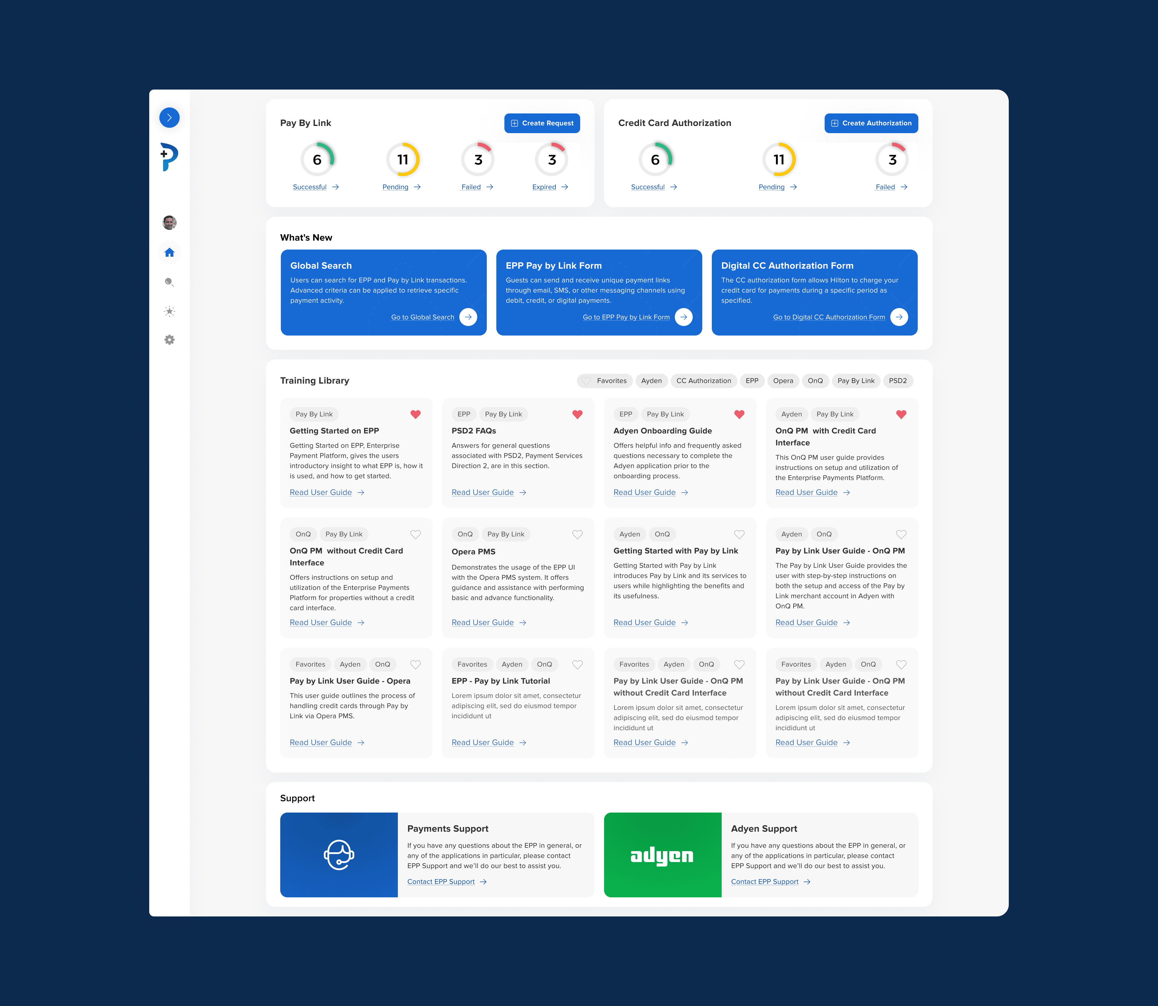
Turned a passive landing screen into an operational starting point with status, exceptions, education, and next actions.
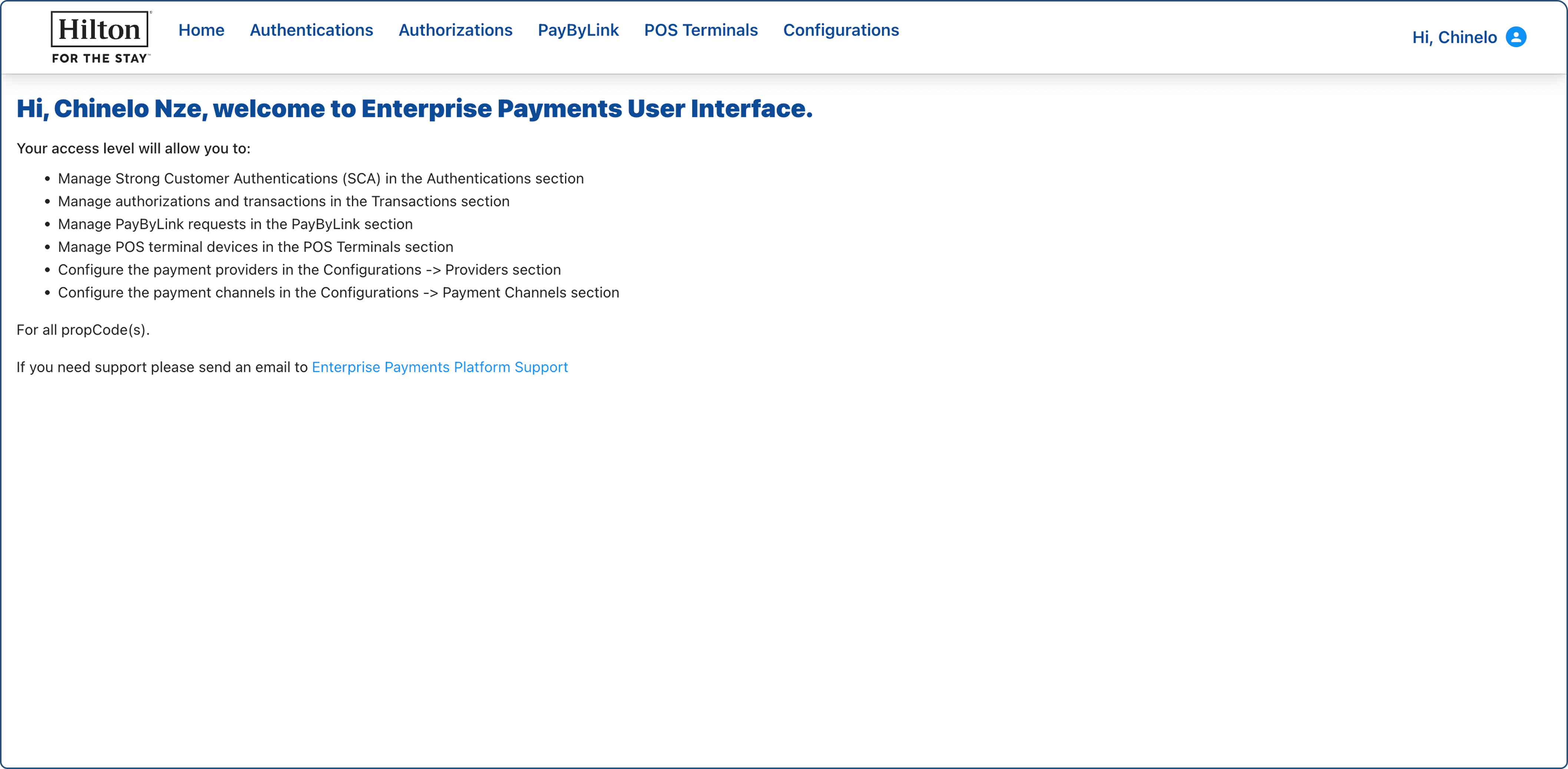
Before - What wasn't working
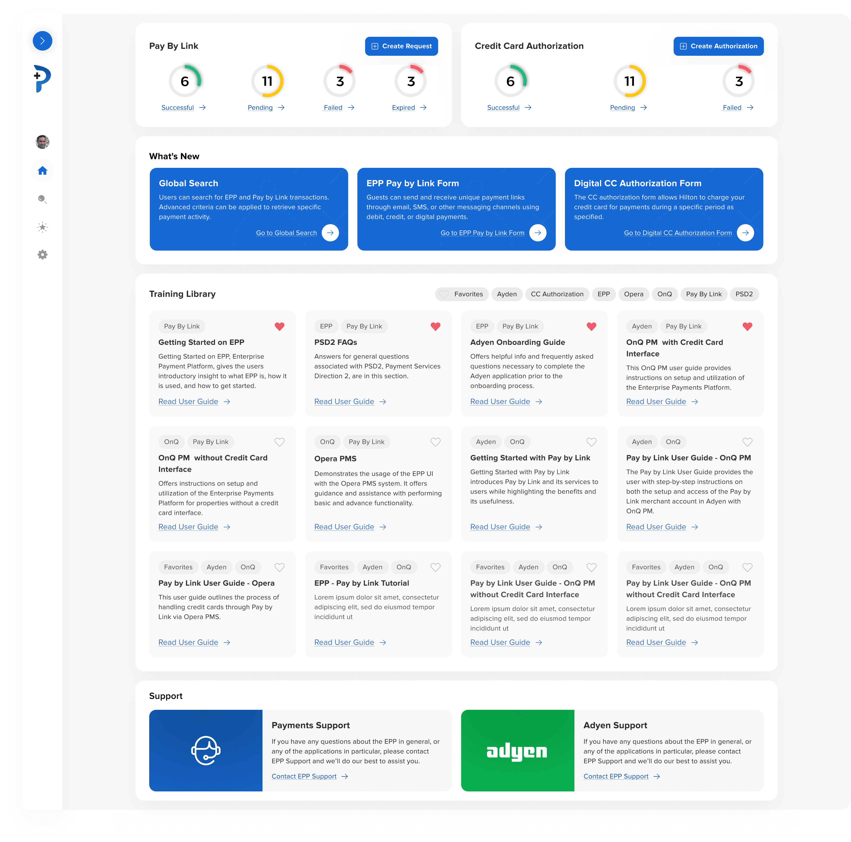
After - A task-oriented starting point
Unify search
Consolidated fragmented payment-type searches into a task-led global entry point with consistent advanced filters.
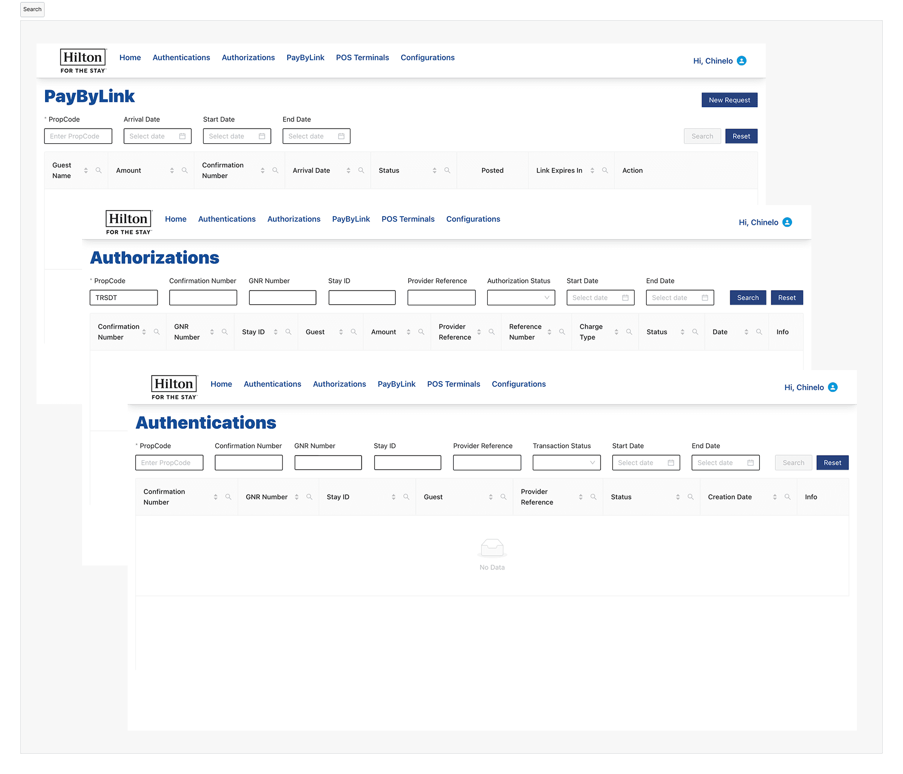
Before - What wasn't working
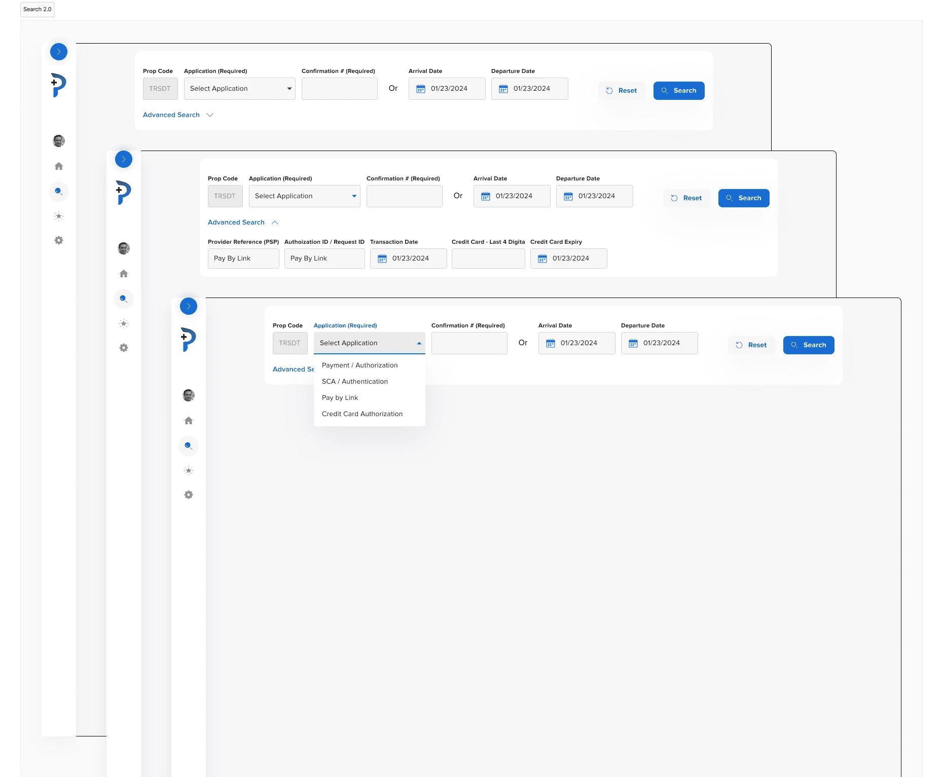
After - Unified search as a global entry point
Connect status and action
Created a clear status taxonomy and mapped each state to valid, contextual actions.
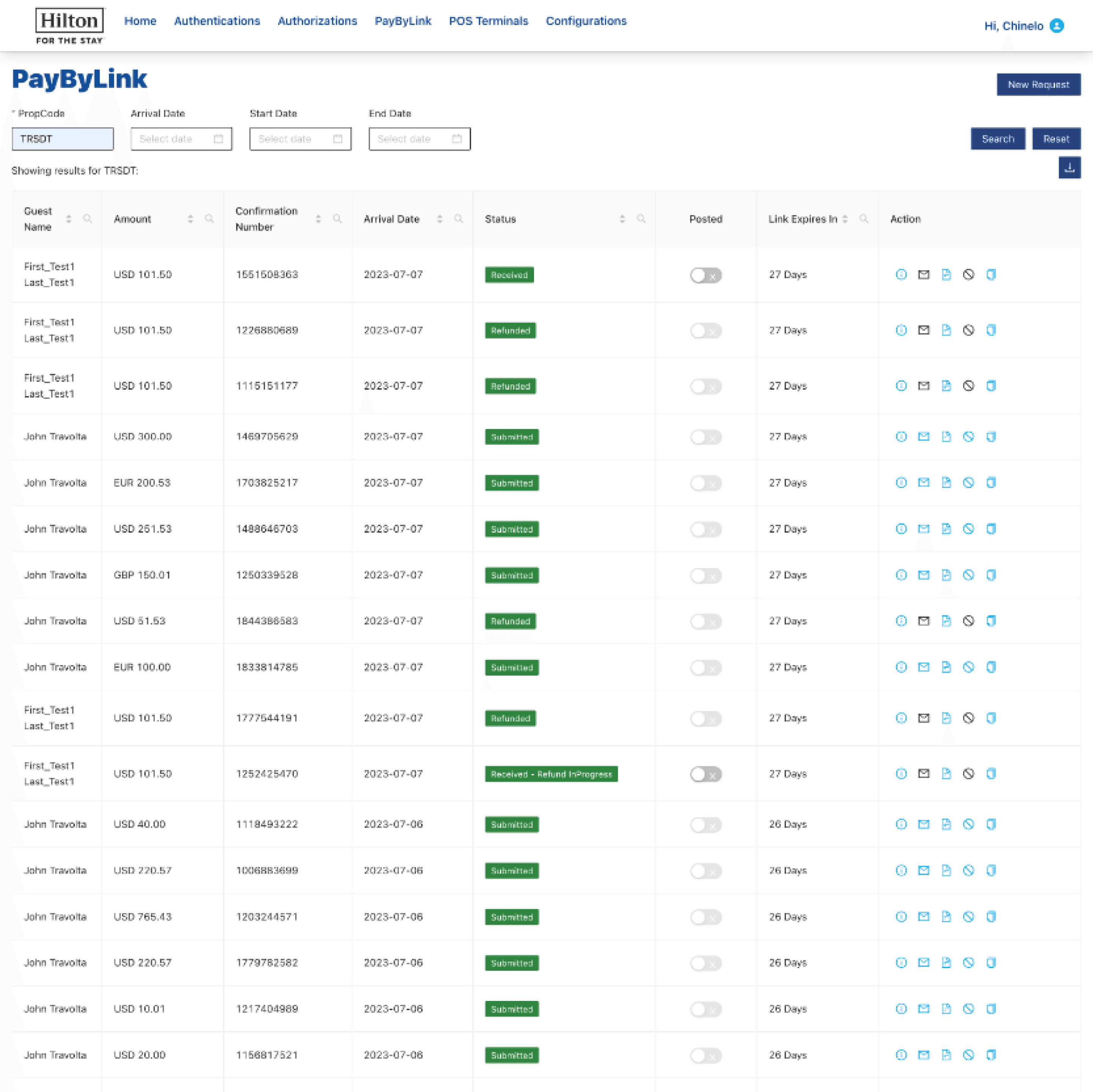
Before - What wasn't working
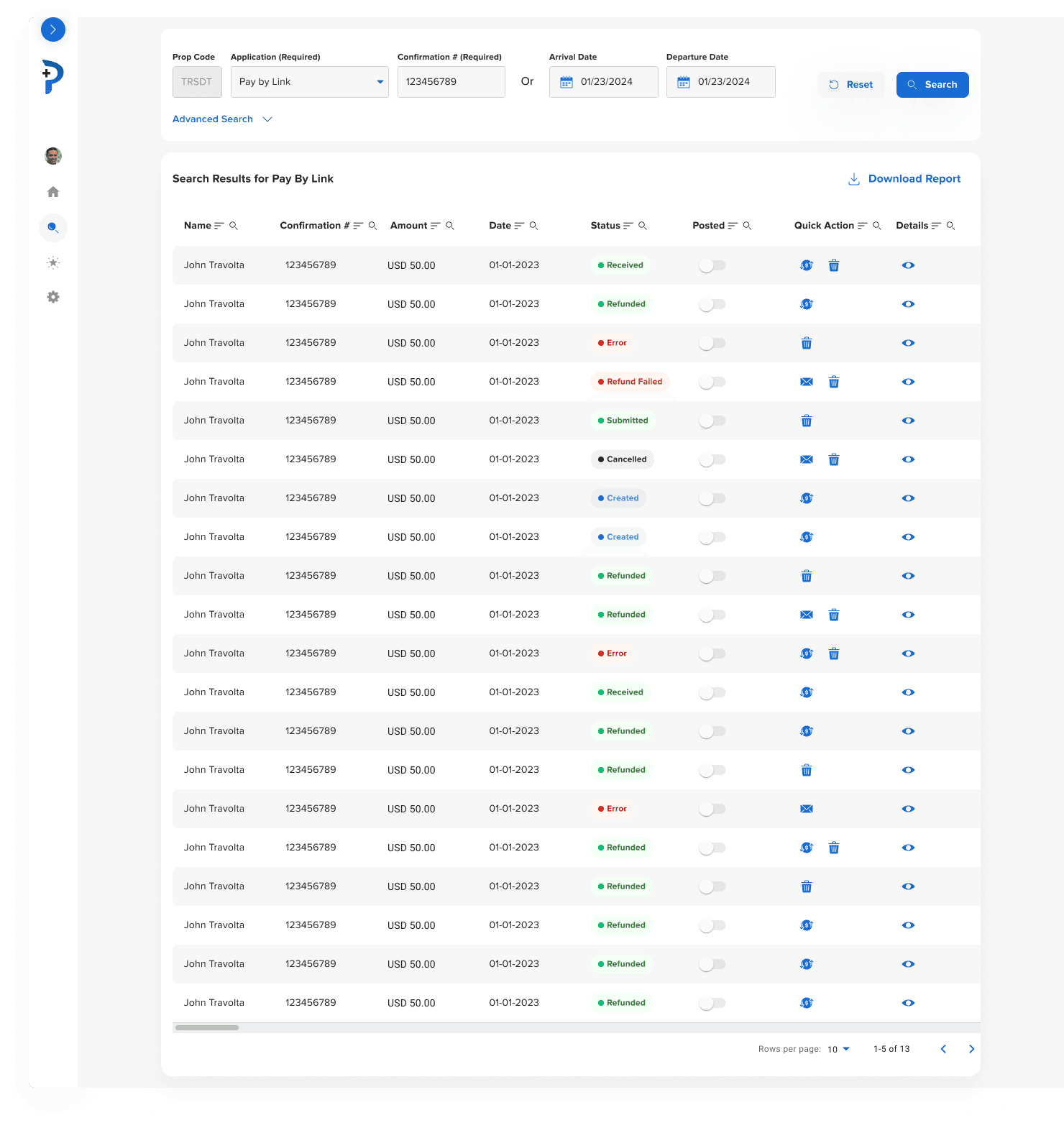
After - Clear status hierarchy and contextual actions
Prioritize by risk and frequency
Sequenced the redesign around daily, high-risk workflows before lower-impact reporting and support needs.
Outcomes & Impact
Projected 50+ ticket/day reduction
Estimated through clearer workflows, stronger self-service, and embedded education.
7,500+ properties supported
Designed for hotel and corporate teams across Hilton’s global portfolio.
Phased rollout
Delivered in early 2025, with positive feedback from operations and engineering.
The best enterprise UX does not remove necessary complexity; it structures that complexity so people can scan, prioritize, and act without depending on institutional knowledge.

Keep scrolling for a deeper look at the research, iterations, decisions, and delivery behind the final experience.
My role
I led all UX design work for this project from discovery through delivery, owning information architecture, interaction design, and visual design across the platform. I partnered closely with a UX researcher to conduct user interviews and usability testing with hotel staff and corporate teams across the US, UK, Ireland, and Australia. I collaborated with Product and Engineering leadership to define requirements, prioritize features, and align on technical constraints across multiple releases.
Understanding the system
Goals and success signals
Each user group had distinct needs, but shared a common requirement: completing high-stakes payment tasks quickly, accurately, and with confidence. Through interviews and shadowing, we identified the key outcomes that would define success for users, the business, and the platform.
Establish a scalable, extensible UX foundation for the payments platform
These goals defined what success looked like for the redesign and guided design decisions throughout the project.
Constraints and complexity
Redesigning the Enterprise Payments Platform required improving usability without disrupting any of the critical internal operations. These are some of the key constraints we had to design within to make sure everything ran smoothly for all users.
Key constraints
Legacy systems and technical dependencies
The platform relied on existing services and data structures that could not be replaced, requiring solutions that worked within established technical boundaries.
Global scale and regional variation
Payment workflows differed across regions due to currencies, regulations, and local operating practices, increasing complexity and limiting one-size-fits-all solutions.
Ongoing feature expansion
New payment methods and capabilities were actively being added, requiring the design to support extensibility without introducing additional complexity.
Cross-team coordination
Design decisions needed to align with multiple engineering teams and roadmap timelines, often with incomplete or evolving requirements.
Early insight
Across workflows, the core challenge was not missing functionality but how information, status, and actions were presented. Complexity existed for valid business and technical reasons, but it was not structured in a way that helped users prioritize, scan, or act confidently.
These insights directly informed which workflows to tackle first and how success would be measured across the redesign.
Design challenge
How might we simplify complex payment workflows across a global enterprise system so that non-technical users can resolve issues quickly and confidently, while meeting business, platform, and regulatory constraints?
Platform structure and workflow mapping
To understand how complexity accumulated over time, I mapped the platform across core workflows, entry points, and downstream tasks. This revealed where users had to understand internal system boundaries just to complete routine work.
As new payment capabilities were added, each introduced its own navigation, search, and transaction flows. Over time, this created fragmented entry points and duplicated patterns across the system.
As a result, users often had to:
Decide where to start before knowing what to do
Navigate multiple sections to complete a single task
Learn system distinctions unrelated to their actual intent
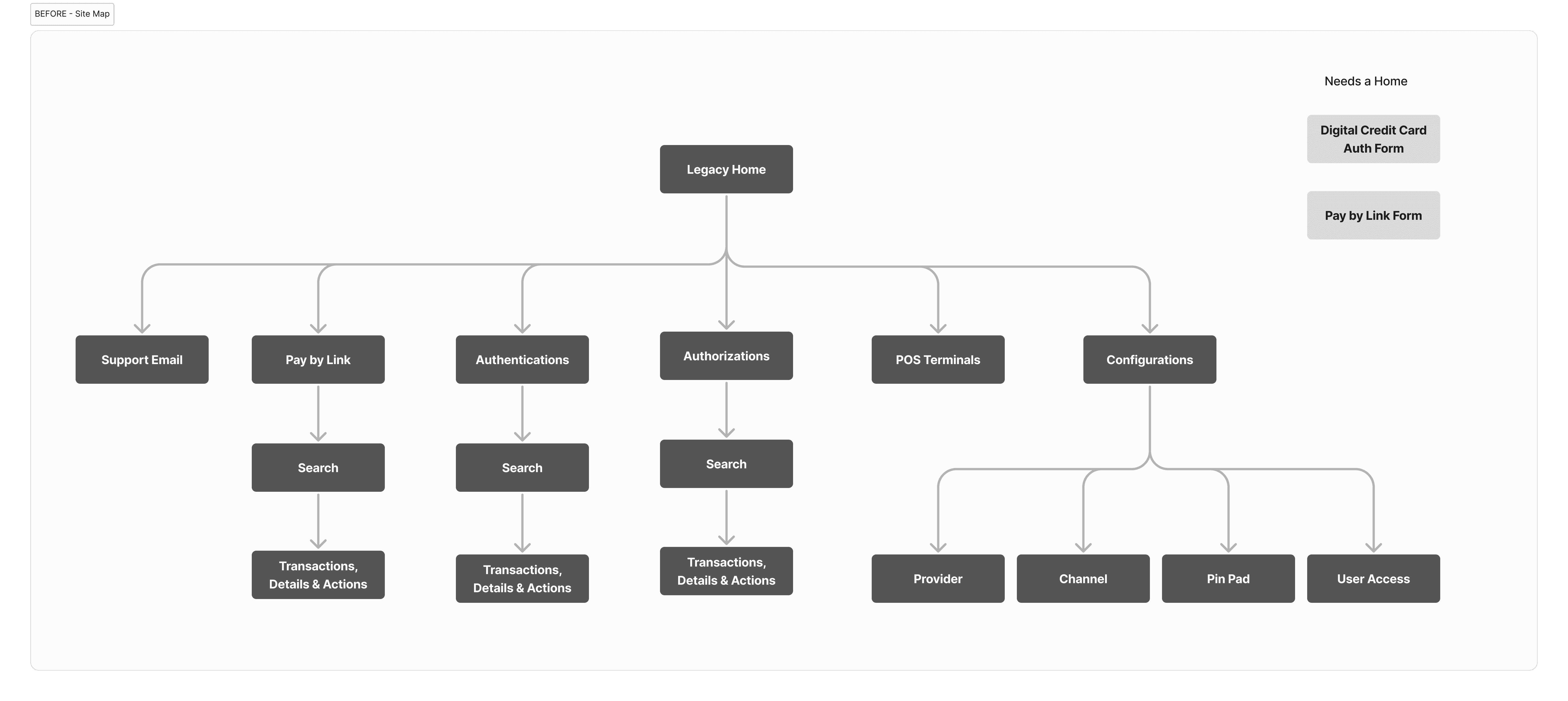
Before: Fragmented, system-led structure
In the legacy platform, workflows like Pay by Link, Authentications, and Authorizations each maintained separate search and transaction experiences. Configuration and support paths were interwoven with operational workflows, increasing cognitive load for everyday users.
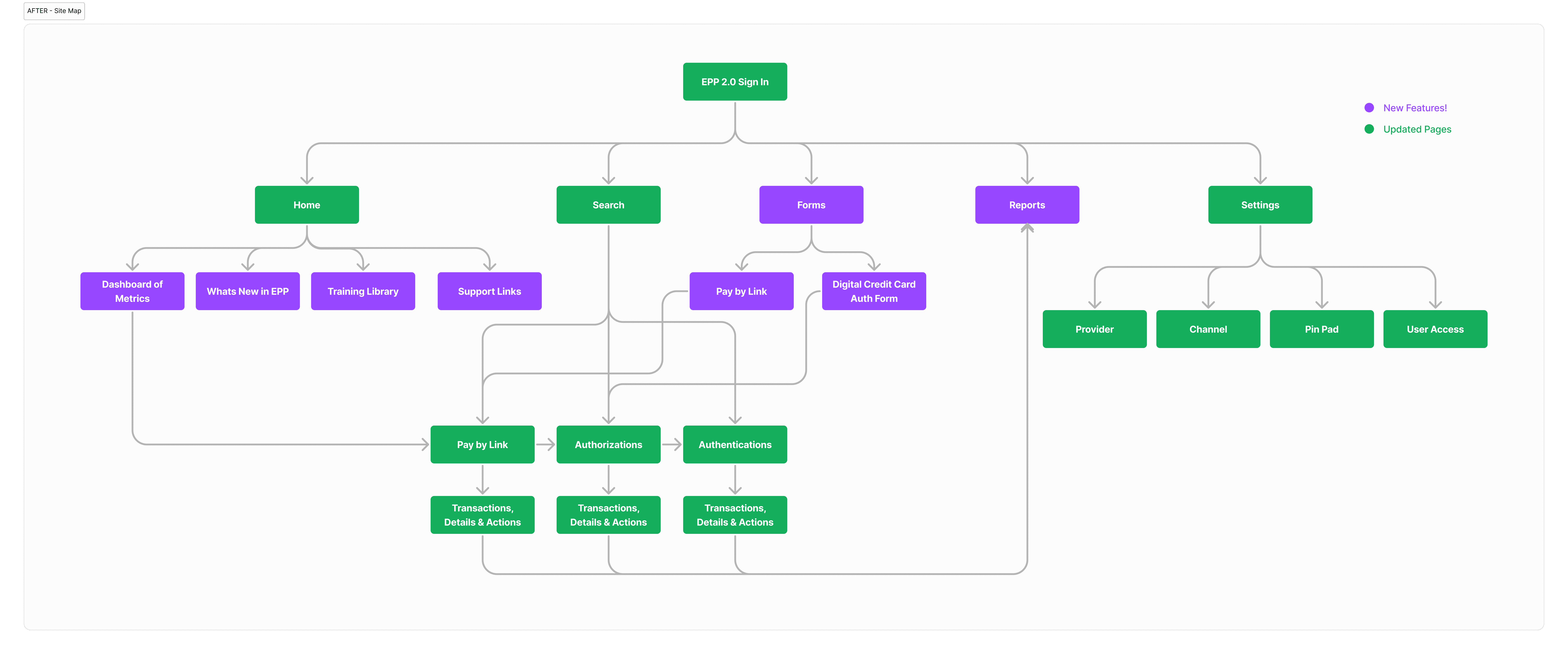
After: Unified, task-led structure
The redesigned platform introduced shared entry points and reusable workflow patterns aligned to user intent rather than system boundaries. Search, transactions, and actions became core, cross-cutting capabilities reused across payment types.
Workflows were reorganized around:
Common entry points
Consistent transaction and action patterns
Clear separation between operations, configuration, and support
This shift reduced navigation overhead, simplified mental models, and created a scalable foundation for new payment methods and regions.
Identifying the highest impact workflows
Core workflows were evaluated based on impact, frequency, operational risk, and complexity to determine where design changes would deliver the greatest impact. Daily, high-risk workflows that served as entry points into downstream tasks were prioritized first.
High-impact workflows
These workflows were addressed first due to their frequency, operational risk, and role as system entry points.
Search
Daily use · Critical risk · High complexity
Primary outcome : Unified global entry point enabling faster issue discovery
Transaction lists and details
Daily use · Critical risk · High complexity
Primary outcome : Improved scannability and clearer status visibility
Transaction actions
(Refund, Delete, Cancel, Clone)
Daily use · Critical risk · High complexity
Primary outcome: Reduced errors through clearer, contextual actions
Medium-impact workflows
These workflows were addressed after stabilizing high-risk paths, focusing on consistency, safety, and improved clarity for regular but less time-sensitive tasks.
Status Dashboard
Daily use · Medium risk · Low to medium complexity
Primary outcome : Centralized visibility into system health
Forms
(Pay by Link, Digital Credit Card Auth)
Regular use · Medium risk · Medium complexity
Primary outcome: Consistent patterns reducing cognitive load
Configuration and settings
Infrequent use · Medium risk · Medium complexity
Primary outcome : Safer changes with clearer structure
Onboarding & Education
Regular use · Medium risk · Low to medium complexity
Primary outcome : Faster ramp-up for new internal users
Lower-impact workflows
These workflows were addressed later to support self-service, reporting, and long-tail needs once core operational paths were stabilized.
Support
Regular use · Low risk · Low complexity
Primary outcome : Fewer escalations through clearer self-service
Reporting
Regular use · Low risk · Low complexity
Primary outcome : More reliable access to standardized reports with reduced dependency on ad hoc requests
Design decisions and solutions
To address the breakdowns identified during exploration, I focused on redesigning key entry points and workflows where clarity, prioritization, and guidance mattered most. Rather than redesigning isolated screens, solutions were framed around how users moved through the system to diagnose issues, understand system state, and take action under time pressure.
The following sections outline the most impactful design decisions and how they addressed real operational pain points.
Home and entry points
The EPP home experience did not function as a true starting point for work. It primarily acted as a static landing page that described other areas of the platform rather than supporting action or decision-making.
Before - What wasn't working
No guidance on what users should do next
A single support email link became the default path for all questions, creating high support volume and poor triage
As a result, users were forced to navigate away immediately to begin any meaningful task, increasing cognitive load and slowing issue resolution.
After - A task-oriented starting point
The home experience was redesigned to function as an operational entry point rather than a passive landing page. It surfaced what mattered most up front and guided users toward the next best action.
System health, exceptions, and high-priority items were made visible immediately
Entry points aligned to common tasks rather than internal system structure
Support and education were distributed contextually instead of funneling everything to a single inbox
This allowed users to orient themselves quickly and begin work without unnecessary navigation.
Key design decisions
Introduced a task-led home layout that prioritized operational signals over documentation
Surface system status, exceptions, and active workflows at the point of entry
Distributed support and educational content closer to where users needed it
Why this mattered?
Reframing the home experience reduced unnecessary navigation and removed reliance on institutional knowledge to get started. It also reduced support burden by helping users self-orient and resolve common issues without escalation.
Most importantly, it established a consistent, scalable entry pattern that supported both current workflows and future platform growth.
Search and discovery
Search was one of the most frequently used and highest-risk workflows in EPP, serving as the primary entry point for investigating payment issues, guest exceptions, and transaction state. However, it was fragmented across payment types and sections of the platform, forcing users to understand system structure before they could complete their task.
Before - What wasn't working
Search was split across payment types, requiring users to know where to look based on backend structure rather than task intent
Filters, layouts, and results varied by page, increasing cognitive load and slowing discovery
It was difficult to quickly identify exceptions or items requiring attention
This fragmentation made issue discovery slower and increased the risk of missed or incorrect actions, especially under time pressure.
After - Unified search as a global entry point
Search was redesigned as a single, global entry point that allowed users to start in one place and refine results without understanding internal payment structures.
From fragmented to unified - Separate search experiences for authentications, authorizations, and Pay by Link were consolidated into one shared, consistent pattern.
From system-led to task-led - Users could search based on intent rather than backend payment models or terminology.
Advanced search to handle edge cases - Standardized advanced search fields supported complex scenarios and specific criteria without introducing additional fragmentation.
Key design decisions
Standardized filters and layouts across all transaction types
Clearer status hierarchy to support fast scanning
Reusable search patterns designed to scale with new payment methods
Why this mattered?
Unifying search reduced navigation overhead and removed a major dependency on institutional knowledge. It also established a scalable pattern that could support new payment methods without reintroducing fragmentation.
This change unlocked improvements across downstream workflows and set the foundation for the rest of the redesign.
Status visibility and actions
Transaction states and available actions were difficult to interpret at a glance. Status indicators relied on subtle visual differences, and actions were presented as icon-only controls without sufficient context. As a result, users often had to slow down, hover, or rely on external knowledge to understand what was safe or appropriate to do next.
Before - What wasn't working
Status colors were visually similar and difficult to distinguish quickly
There was no clear relationship between transaction state and available actions
High-risk actions were not clearly differentiated from low-risk ones
This lack of clarity increased cognitive load and introduced unnecessary risk in high-stakes workflows where speed and accuracy were critical.
After - Clear status hierarchy and contextual actions
Status and actions were redesigned to work together, making it immediately clear what state a transaction was in and what actions were available or safe to take.
From ambiguous to explicit - Status indicators were redesigned with clearer visual hierarchy and semantics, making exceptions and errors easier to spot at a glance.
From static actions to contextual actions - Available actions were directly tied to transaction state, reducing guesswork and preventing invalid or risky actions.
From icon-only to understandable controls - Actions were surfaced with clearer affordances and labeling, improving confidence for non-technical users operating under time pressure.
Key design decisions
Defined a clear status taxonomy with consistent visual treatment across workflows
Mapped transaction states to allowed actions to prevent errors and unsafe operations
Differentiated high-risk actions through hierarchy, placement, and visual emphasis
Standardized action patterns so users could rely on consistency rather than memory
Why this mattered?
Improving status visibility and action clarity reduced hesitation and error risk in critical workflows. Users could quickly understand system state, prioritize issues, and act confidently without relying on institutional knowledge or secondary confirmation.
This change directly supported faster issue resolution and created a safer, more predictable interaction model across the platform.
Final solution overview
The redesigned Enterprise Payments Platform unified search, status visibility, and action-taking into a cohesive, task-led experience built for high-stakes, global operations.
Instead of optimizing individual screens in isolation, the solution focused on establishing shared patterns across core workflows. This enabled users to quickly understand system state, identify issues, and take the correct next action with confidence. Business, technical, and regulatory complexity was preserved where necessary, but structured to be easier to scan, prioritize, and act on under pressure.
The result was a scalable foundation that supported existing payment workflows while enabling new payment methods, regions, and capabilities to be added without reintroducing fragmentation or cognitive overhead.
Solution walkthrough
The walkthrough below highlights how these patterns come together across the platform.
Impact
Phased rollout completed in early 2025
Reduced support tickets by an estimated 50+ daily through clearer workflows, improved self-service, and embedded training resources
Improved task efficiency and accuracy across high-volume payment operations serving 7,500+ global properties
Received positive feedback from hotel operations and engineering teams, validating both usability and technical scalability
Established reusable interaction patterns across search, status visibility, and action-taking that can scale with new payment methods
Created a scalable foundation for future payment capabilities and Hilton enterprise tools
Reflections & key learnings
Designing for the Enterprise Payments Platform required balancing dense data structures, complex workflows, and diverse user roles within a single system. This work deepened my ability to apply systems thinking in enterprise environments while maintaining a strong focus on clarity, usability, and human decision-making.
Through close collaboration with engineering and research, the redesign transformed EPP from a fragmented, opaque tool into a cohesive, task-led platform. The result is an experience that supports Hilton’s global payment operations at scale while remaining intuitive, resilient, and extensible as business needs continue to evolve.
